

TL;DR: An upgrade path is not a “Subscribe to premium” button. It’s five things working together: one clear reason to pay, a free tier that proves value without giving the paid product away, upgrade prompts placed at the moment of peak interest, pricing that nudges people toward annual, and a first 30 days that stops churn. Most creators have a paid tier and no path to it.
Benchmarks: roughly 3% free-to-paid is realistic, 5%+ is strong, and the Beehiiv platform median sits under 1%.
Welcome to The Digital Creator, helping creators accelerate with AI by showing you how to start, create, grow, and scale faster.
Fewer than 1 in 150 free readers will ever pay you.
That’s roughly where the median newsletter lands. Beehiiv’s 2026 paid-newsletter report puts typical free-to-paid conversion under 1%, with the platform median around 0.62%.
Now do the math on a list of 1,000 free subscribers at $150 a year:
→ At 0.6%, that’s 6 paying members. About $900 a year.
→ At 3%, that’s 30 paying members. About $4,500 a year.
Same list. Same content. Five times the revenue. The only difference is whether there’s a path between “I enjoy this newsletter” and “I’m paying for this newsletter.”
Most creators never build that path. They grow the audience, publish consistently, add a paid tier in the settings, and then wait. A footer link says “Upgrade.” Nothing else changes.
That’s not a path. That’s a door in the middle of a field. It’s the same gap I flagged in the guide to monetizing your audience: attention without a next step doesn’t turn into revenue.
I know this one personally.
My list came over from Beehiiv, built before I had a paid tier. The content was never designed to lead anywhere. So this issue is part playbook, part audit of what I’m fixing in my own newsletter right now.
If you’ve already run a Substack newsletter audit, you’ve cleaned up the front door. If you’ve been working through the newsletter monetization blueprint or the creator revenue playbook, this is the next layer: turning the audience you’ve built into recurring revenue.
Let’s get into it. 👇
First: Which Creator Are You?
Your starting point decides which part of this playbook you need.
🟡 Stage 1: Free list, no paid tier. You have subscribers and nothing to upgrade to.
→ Start at Part 1, then jump to Part 2.
🟠 Stage 2: Paid tier exists, almost nobody’s on it. You’re below 1% and not sure why.
→ Start at Part 2.
🔴 Stage 3: You get upgrades, but churn eats them. People join, then leave within a few months.
→ Start at Part 5.
Outline:
Part 1: Know Your Number
Part 2: Why Free Readers Don’t Upgrade
Part 3: Design the Free/Paid Line
Part 4: Upgrade Prompts That Don’t Feel Pushy
Part 5: Pricing That Pulls Toward Annual
Part 6: The First 30 Days
Part 7: Your 7-Day Sprint
Part 1: Know Your Number
You can’t fix a funnel you’ve never measured.
Your conversion rate is paid subscribers ÷ total subscribers. That’s it. Pick one definition and stick to it, because every benchmark online uses a slightly different one.
Here’s what the data actually says:
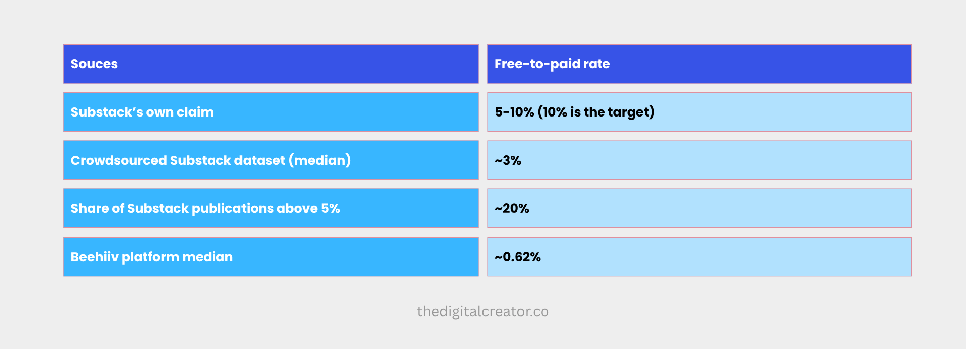
The Substack figures come from a crowdsourced dataset of hundreds of publications, where the author found a 3% median and only about one in five publications above 5%. Substack’s “5–10%” is the number you’ll hear most often. It’s closer to a ceiling than a plan.
Two honest caveats:
→ These datasets are informal and platform-reported. They aren’t random samples, and platform data can skew optimistic.
→ Conversion varies by niche. Finance and investing lists have top-decile performers near 20%. Most categories don’t.
So here’s the rule I use: 3% is a realistic target. 5%+ is strong. Under 1% means the path is broken, not that your audience is bad.
Do this now: open your dashboard, divide paid by total, and write the number down. Everything else in this playbook is measured against it.
Part 2: Why Free Readers Don’t Upgrade
The usual guess is price. Or content quality. Or timing.
Mack Collier’s analysis of why free subscribers aren’t upgrading points somewhere else: free readers don’t know what changes when they upgrade.
Not “it’s too expensive.” Not “I don’t like it.” Just: what do I get that I don’t already have?
If a stranger can’t answer that in ten seconds on your paid page, you don’t have a pricing problem. You have a clarity problem. It’s the same disease as content that doesn’t convert, just one step further down the funnel.
The One-Benefit Rule
Most premium tiers list everything. Mine does too:
→ 5 Premium Claude Skills
→ AI Agents Collection
→ Substack SEO/AEO Implementation Toolkit
→ 45% off paid courses
→ Community access
That’s a great list. It’s also a terrible headline. A list of five things reads as “a bundle of stuff,” and bundles are hard to want.
So I’m leading with one: the AI Agents Collection.
Why that one?
Because it answers the question every reader of this newsletter is already asking: how do I get this done without doing it myself? It’s a curated library of agents built around the workflows I use to run The Digital Creator, the same idea behind the 50 AI agents you can build and sell.
It’s the clearest “different, not just more” benefit in the tier. The rest become supporting proof.
Here’s the test for your own tier:
List everything in your paid offer.
Circle the one benefit a free reader would trade money for first.
Rewrite your paid page headline around that single benefit.
Move everything else below it as supporting detail.
“More” vs. “Different”
This is the second thing that kills upgrades, and it’s the main churn driver in paid newsletters: paid content that doesn’t feel meaningfully different from free.
If your premium tier is “the same kind of post, but there’s more of it,” readers can’t justify the jump. If it’s tools, systems, and assets they can use, it’s a different product.
That’s the principle behind Part 3.
Part 3: Design the Free/Paid Line
Where you draw the line between free and paid is the single most important design decision in this whole system.
Draw it too high and you give away the product.
Draw it too low and new readers bounce before they trust you.
The rule I use
Free = the what and the why. Paid = the tools and the done-for-you.
Every free issue should deliver a complete idea.
The reader finishes it and thinks, “that made sense, and I could try it.” Then, in the same issue, they can see the paid asset that makes it faster.
For me, that looks like this:
→ Free: the playbook, the framework, the reasoning, the screenshots of how I do it. → Paid: the pre-built Claude Skills, the AI Agents Collection, the toolkit, the community.
If you’ve read how I built three AI agents that write my newsletters, you know the free version gives you the approach. The Premium version is the part that saves you the build.
Three ways to gate (and which to pick)
1. Teaser gating. You publish the first part of a post and put the rest behind the paywall.
✅ Good for deep, high-effort pieces.
❌ Can frustrate new readers if overused.
2. Asset gating. The post is free. The template, skill, or agent that implements it is paid.
✅ Matches “different, not more.” Readers see the value before they pay.
❌ Needs real assets, not repackaged PDFs.
3. Archive gating. Recent posts free, older back-issues paid.
✅ Easy to set up.
❌ Weakest on its own, because it only gates content readers can find elsewhere.
My pick: asset gating as the core, with an occasional teaser for premium-only deep dives. Archive gating alone is the weakest option, so don’t rely on it.
Two gating mistakes
Gating randomly. If readers can’t predict what’s free and what’s paid, they stop trusting both. Pick a rule and publish it.
Under-gating. If your free posts already include everything in the paid tier, the paid tier has nothing left to sell. A free tier that’s too generous quietly kills the upgrade.
Part 4: Upgrade Prompts That Don’t Feel Pushy
Here’s what a typical upgrade prompt looks like:
Enjoying this? Upgrade to a paid subscription to support my work.
It tells the reader nothing and asks them to pay out of goodwill. Goodwill converts at about the rate your data already shows.
A better prompt does three things: names the specific benefit, ties it to the post they just read, and makes the next step obvious.
Where to put prompts
The mistake is putting the pitch in the intro. The reader hasn’t received anything yet.
Place it right after the payoff. They’ve just finished a section that solved a problem. That’s the moment their interest in the answer is highest.
I use four touchpoints:
1. The in-post prompt. One per issue, specific to that issue’s topic.
If you want the exact agents I use for this workflow instead of building them yourself, that’s what the AI Agents Collection inside Premium is for.
2. The welcome email. The first email a new free subscriber gets. Show them what Premium contains and what it replaces, and link to a single “what’s inside” page. This is where most creators leave money on the table, and it works the same way as fixing a lead magnet that isn’t converting.
3. The behavior-triggered nudge. When someone clicks a paid-asset link or replies with a question, follow up with the relevant premium resource. Their action told you what they care about.
4. The “what’s inside” page. One page. Lead benefit as the headline, a short demo or screenshot of the agent in action, the full list below, the price, and a clear button.
Show, don’t tell
One of the most common things free readers say they want is a way to try the paid experience before committing.
You can’t hand out free trials of everything, but you can give them a real sample:
→ A short screen recording of one agent doing a task start to finish.
→ One complete premium asset released free, clearly labeled as a sample.
→ A teaser section from a premium deep dive.
The sample answers the question Part 2 flagged: what do I get that I don’t already have?
Keep it from feeling like an ad
One case study I found tied heavy promotion to lower free-to-paid conversion, because readers signed up and later felt the experience turned spammy. Keep it to one specific prompt per issue, matched to the topic. Generic footers repeated every week train people to ignore them.
Part 5: Pricing That Pulls Toward Annual
The benchmark
Beehiiv’s data puts the median paid newsletter at $10 a month or $100 a year, unchanged since 2024. Price varies more by category than by audience size. Investing newsletters sit near $27 a month. Travel sits near $7.
So pricing alone isn’t what’s holding most creators back. The structure around it is.
My numbers
Premium is $39 a month or $150 a year.
Here’s the framing I should have been using the whole time:
→ 12 months of monthly billing: $468.
→ Annual: $150.
→ That’s about 68% off, or about $12.50 a month.
→ Put another way, the annual plan costs less than 4 months of monthly billing.
Most creators describe this as “save 40%” or “save 2 months.” The real number is stronger, so say the real number.
Why push annual
Two reasons, both from the data:
→ Annual subscribers churn significantly less than monthly subscribers. Monthly members get a decision point every 30 days. Annual members get one a year.
→ Annual plans overtook monthly as the main source of subscription revenue on Beehiiv by mid-2025. It’s where the money is going.
Practical moves:
Show annual first on your paid page, with the 12-month monthly total ($468) next to it for contrast.
Display the per-month equivalent ($12.50).
Offer annual early, not only after someone has already churned from monthly.
A word on discounts
I’m cautious about heavy discounting.
The evidence is anecdotal, not a controlled study, but multiple writers report that subscribers who upgrade through a discount churn faster than those who pay full price.
Annual pricing already works as the discount.
Lean on value, not coupons.
Founding-member tiers
Founding tiers typically run $100–$500 a year, justified by perks rather than content. For a one-person business, I’d skip it until the basics work. Another tier means more support and more to maintain.
Part 6: The First 30 Days
Getting someone to pay is half the job.
Keeping them is the other half, and it’s where most solo creators go quiet.
A new paid member is at peak excitement and peak doubt at the same time. If the first month doesn’t deliver a win, they leave. Substack’s retention tab shows paid cohort retention at 1, 6, and 12 months. Watch the first one closely.
The 30-day onboarding sequence
Day 0: Welcome + one asset. Don’t dump the whole library. Send the single best thing. For me, that’s one agent from the AI Agents Collection and a two-sentence “do this first.”
Day 3: Quick win. A short email: “Here’s how to get your first result in 10 minutes.”
Day 7: Check-in. One line: “Did the agent work for you? Reply and tell me what you’re trying to automate.”
Day 14: Next step. Point them to the second asset, matched to what they replied.
Day 30: Feedback ask. “What’s been most useful? What’s missing?”
Ask why they upgraded
On the Day 7 email (or sooner), ask every new paid member one question:
What made you decide to upgrade?
It costs nothing. The answers become your headline, your “what’s inside” copy, and your next prompt. It’s the cheapest market research you’ll ever run, and it’s coming from people who just paid.
Fix the leaks
Beehiiv’s report recommends three retention basics, and they apply on any platform:
→ Recover failed payments. Some cancellations aren’t decisions. They’re expired cards.
→ Present a retention offer at cancellation. A pause or a switch to annual can save the subscriber.
→ Benchmark the whole funnel, not just subscriber count: free-to-paid rate, monthly vs. annual mix, and retention curve.
Part 7: Your 7-Day Sprint
You don’t need a rebuild. You need a week.
Day 1: Measure. Calculate your free-to-paid rate. Write it down.
Day 2: Pick the lead benefit. Circle the one thing a free reader would pay for first. Rewrite your paid page headline around it.
Day 3: Audit your last 10 posts. For each, mark what’s free, what’s paid, and where an upgrade prompt belongs. Flag any post with no connection to the paid tier.
Day 4: Fix the pricing frame. Calculate your real annual discount. Put annual first on the page. Show the per-month price.
Day 5: Write the welcome email. Show what Premium contains, link the “what’s inside” page, and attach one real sample.
Day 6: Build the 30-day sequence. Five emails, five lines each. They don’t need to be polished.
Day 7: Publish one upgrade-led issue. One prompt, specific to the topic, placed after the payoff. Then leave it alone for 30 days and re-measure.
✅ Checklist before you hit publish on anything:
👉 Can a stranger name the lead benefit in 10 seconds?
👉 Is it clear what’s free and what’s paid?
👉 Does each post have one specific prompt, not a generic footer?
👉 Is annual shown first, with the real discount?
👉 Does a new paid member get a win in week one?
The Bottom Line
The goal was never a bigger list. It’s a list with a path through it.
A subscriber who reads your newsletter for a year and never sees a reason to pay isn’t a failed conversion. They’re a missing system.
Build the path. Clarify the lead benefit. Show a real sample. Price annual first. Make the first 30 days count. Do that, and you stop depending on goodwill and start building recurring revenue.
If you want the agents, skills, and toolkit behind the workflows I write about, that’s what Premium Membership is built for:
→ AI Agents Collection: a curated library of agents built around the workflows I use to run The Digital Creator
→ 5 Premium Claude Skills
→ Substack SEO/AEO Implementation Toolkit
→ 45% off all paid courses
→ Community access
$39/month, or $150/year.
That’s about 68% off, and less than four months of monthly billing.
One question for you: what’s your free-to-paid rate right now? Hit reply and tell me. If it’s under 1%, tell me what your paid page says. I’ll tell you what I’d change.
See you in the next one, Sharyph